First 30 Seconds at the Reception

The first thirty seconds inside a space never feel long, yet the lingering impression they carry cautiously influences the tone and nature of the visit that follows.

India has witnessed a vivid growth spurt in business over the last decade. Emerging founders, entrepreneurial opportunities, coworking spaces, and even temporary commercial hubs have found ways to develop.

Be it a suspicious-looking building or just another glass-box skyscraper, we rarely gauge the character of an office solely through its façade.

Beyond referrals, websites, and conversations with affiliated parties, something about the space drew us to its physical address. That first impression served its purpose: inviting fresh eyes and curious movement.

Sufficient for entry. But now the space must step up. What, then, becomes the new logo for a commercial venture?


Welcome aboard:

Experience is everything. Even within a limited span of time, it holds the power to shape opinions through the moods and feelings we perceive.

The reception area is where everything condenses into a singular moment. Intent, pause, etiquette, and inquiry all converge here. 

It becomes a display of the host to the guest, signalling preparedness: not just of the room, but of the people who inhabit the larger environment.

These individuals have curated this threshold for varied encounters, all leading to dialogue.

Upon arrival, the goal is to forget what could not be controlled: dense contexts, repetitive commercial clusters, or unremarkable entries. Whether these worked or not, the reception should not let them define the experience.


Reading between the lines:

This threshold is far from passive. Though often treated as a pause point, the way one enters, waits, or is guided forward begins to shape interaction. It subtly informs body language and expectation.

Hierarchy is inherent to office environments. At entry, the guest and host form the primary dynamic, while objects occupy a secondary role.

Hospitality here exists even without conversation. Proportion, material, light, and spatial language have already been spoken from the first moment.

No interaction is in itself an interaction when every impression is calculative. 

How much a reception unveils about the larger office, how much it chooses to mask to create a self-contained room, what are the bounding lines in this domain are valuable questions that make this a miniature design esquisse during an interior proposal.


Are we doing just enough?

Accessibility of all forms becomes explosive.  The more your space feels accommodating, the faster time naturally dissolves without inducing any negative bias. 

The next time you find yourself at a reception: behind the desk or in front of it, observe how naturally the space operates. It often reflects a glimpse of what a first-time visitor might feel.

The next time you are positioned at the reception, behind the desk or right in front of it, a simple check of how natural the space feels can gauge a lot about what a stranger would perhaps feel coming there. 

But comfort must be temporal here. 

A seated participant is an active call to action: not just to the reception spokesperson but the entire layout. Unknown Intent coming from anyone is uncertain but can never be gambled with from an economic standpoint.


Chemotest Office:

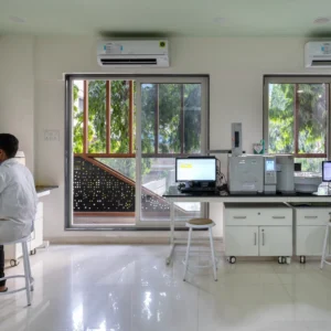
Testing labs typically come with a clean, medically sound design language. Emotionally, visitors often come from a place of inquiry, consultation and associated tasks. 

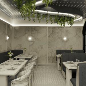
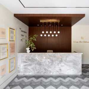
At Greenhatcch Architects, the entry envisioned a bright and warm welcome within the compact space. Material finishes were at the forefront of the structural elements as well as objects and furniture existing in this area. 

The side wall reinforces confidence and trust through statistics and testimonials but before that, the space is already offering a much more lively welcome and halt by the wide reception.

Wooden finishes gradually unfold to the working areas creating a smoother transition along with fluid tile work ensuring a pause that doesn’t turn to a lingering stop 

Design must respect time without eliminating pause.

Spaces should engage without distracting from purpose.
Accommodation must offer respect over indulgence.
Transitions should feel fluid, not abrupt.


Even in departure, the space leaves behind a subtle residue of comfort. A reminder that in environments defined by precision, design can still make room for reassurance.
Chemotest Office:
Entry + Reception
Courtesy: Greenhatcch Architects

Overview:

In these brief moments, design reveals its sharpest understanding—not of theory, but of people, behaviour, and intent.

Spaces that rely on excess often mask sterile environments that fail to balance hospitality with momentum.

The first thirty seconds at a reception can shift from fleeting to lasting only when storytelling resonates on both ends—drawing from the values a company upholds and translating them into spatial strategies with clarity and honesty.
Our endless pursuit of Detail

Architecture is often understood through its visible outcomes

Bold and inspiring forms,

Experiential use of scale, 

Ingenious experimentation in material. 


Yet for a deeper analysis and engagement, we return elsewhere. Behind every resolved surface exists a layer of decisions, where intent is negotiated through precision. It is here, in the pursuit of detail, that design begins to reveal its discipline.

The eye level, our extent through the hands and legs and environment around us allows us to interact with a calculative composition of joineries, complexities, modularity and assemblies. 

Sometimes we do express these technicalities visually, otherwise preferring quieter and simpler finish surfaces. What remains in both cases is their functional and aesthetic contributions.


Designers First: 

Our training equips us to interpret the world with a layered lens,

Decode key problems,

Develop a mind rooted in trial and error,

Deploy productive solutions.


This iterative mindset extends across creative disciplines. As architects, however, we often begin at an unusual point: the finer grain. By resolving edges, junctions, and sequences early, we construct a larger clarity. The macro is frequently a consequence of how precisely the micro has been understood and addressed.


Because Simplicity ultimately takes efforts: 

The pursuit of detail is not always a matter of perfection, but of clarity. Drawings afterall must become grounded and feasible realities.

Design is the alchemy of turning speculated solutions into workable prototypes that can be replicated under set instructions. When drawings are largely tested against reality, inherent assumptions are refined, and restraint becomes a discipline. 

Design styles are a good example of this. Showcasing complexities of construction is not a bad design call but neither is forcefully masking it.

The end motive is always in achieving a complete process. One that ticks major prerequisites.

RoyResidence
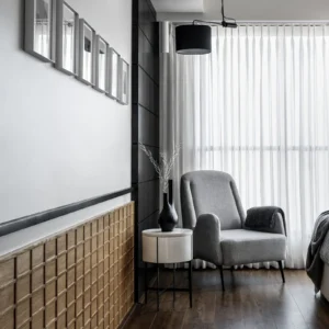
Skirting & Panelwork
Courtesy: Greenhatcch Architects

Sometimes about the texture, sometimes the aspirations, sometimes a translation of the moodboard. Here, the success of a space lies not in what is added, but in what is deliberately held back.


What drives this thinking: 

This pursuit may seem endless, even obsessive at times. Yet it is this very rigour that allows architecture to move beyond assembly.

Detailing transforms construction into intention: ensuring that what is built carries complete coherence, longevity, and resolution that goes beyond early impressions.

And yet, for all its rigour, detail carries a quiet irony. The better it is resolved, the less it demands attention. It slips into the background, doing its job so well that it almost disappears. Perhaps that is the real test:

Not to be seen, but to be trusted.

CHEMOTEST OFFICE
Jali Pattern
Courtesy: Greenhatcch Architects

Who has the most stake involved: 

Funnily enough, the intent as discussed can largely vary with the briefs. The value of detail often shifts depending on who is observing it. 


What may feel critical to the designer can appear minimal, even invisible, to the end user.

This is not a rejection or a failure on part of the detail. This is its nature. 

The Ivory Fork
Ceiling Recess Lights
Courtesy: Greenhatcch Architects

Rather, most users cannot read the relevance of individual components from a composition of cabinets, fixtures, claddings, lights, recess and more unless directly subtracted from the view.

These moments might appear in final photographs, or might not even directly be the point of focus ever yet remain fundamentally functional to the living ecosystem.

“Good design is obvious. Great design is transparent.” — Joe Sparano

Invisible design operates precisely in this realm. It does not demand attention, yet it governs comfort, usability, and coherence.

Detail, therefore, is less about being seen and more about being experienced, subtly reinforcing the relationship between user and environment without ever interrupting it.


Overview: 

There is an invisible labour embedded in this process. Hours spent resolving a corner that may never be consciously noticed, iterations that refine a line by millimetres, conversations that weigh aesthetics against performance. 

It is a duty we as Architects abide by. Starting as a conscious decision, it becomes second nature to any designer. To get to the bottom of every task in its rawest and most minute form possible.


To engage in a dialogue at this platform. Between ideas and materials. Its dimensions and perception. All of this done irrespective of the audience. 


In many ways, detailing becomes a form of authorship. It reflects how carefully a designer listens to the material, the context, and the brief. This becomes the biggest commitment.

Architecture lingers in the ease of use, the comfort of occupation, the absence of friction. And somewhere within that effortlessness lies the outcome of an endless, often invisible pursuit.

When did Glass become the default?

Glass today is rarely questioned. What appears as the obvious choice for façades pretty often extends to partitions, offices, even homes. But this rampant “default” is surprisingly relatively recent.

Today it signals many things, often in a not so transparent but somehow inherent manner, often without interrogation.

Somewhere along the way, we feel its adoption became less of a choice and more of an inheritance.

Origins 

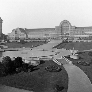
The architectural use of glass expanded dramatically with industrial advancements in the 19th century. The Crystal Palace (1851) demonstrated how glass could move beyond openings to become an entire structural skin.

Image source: Wikipedia

References like Transparency: Literal and Phenomenal by Colin Rowe and Robert Slutzky, and essays on ArchDaily and RIBA Journal, further trace how glass evolved from innovation to ideology, eventually embedding itself as a global architectural language.

In India, the proliferation of glass façades accelerated alongside liberalisation and globalisation in the 1990s and early 2000s. Corporate architecture began aligning with international aesthetics, supported by a rapidly expanding ecosystem of façade engineering, glazing systems, and material supply chains.


Through Symbolism and Meaning 

Glass has been given a voice to represent more than enclosure. 

Earliest renditions began to signal openness, progress, and institutional transparency. Buildings like Seagram Building framed corporate clarity, while the Apple Park uses glass to dissolve boundaries between inside and outside.

Yet psychologically, constant visibility alters how we occupy space. Transparency, when continuous, can feel less like openness and more like exposure, quietly reshaping behaviour, comfort, and spatial hierarchy.


The Contradiction 

Despite its visual lightness, glass often performs poorly in many climates. High heat gain, glare, and dependence on mechanical cooling create long-term inefficiencies. 

Image source: Pexels
Courtesy: @Arefin Shamsul

In the Indian context, fully glazed façades frequently contradict climate-responsive design principles, especially in regions with intense sunlight, where comfort is achieved not through exposure, but through calibrated protection.


What’s Being Ignored

The persistence of glass is far from accidental. It is supported by industry, familiarity, and aspiration.

Most importantly, decades of efforts fueled into refining accessibility and procurement.
This reliance has grown strong enough to sideline more nuanced, climate-responsive approaches.

There is a certain inertia at play. Questioning glass means rethinking systems, and that shift, while necessary, is rarely immediate or convenient.


Larger Dilemma:

Rather than focusing solely on replacing materials, the opportunity lies in rethinking spatial strategies.

While the glass industry operates at a massive, established scale, meaningful change does not always require dramatic material shifts. It begins with design intent.

Image source: Pexels
Courtesy: @Pixabay

If commercial spaces can move beyond flat visual statements and engage with section, layering, and climate, the expression of architecture becomes richer, more responsive, and less dependent on a single material narrative.


Overview:

Modern need not translate to uniform, reflective skins. True modern thinking is responsive, contextual, and efficient. The widespread use of glass today suggests a drift toward visual sameness rather than innovation.

Perhaps the more relevant question is not whether glass works, but whether we are still actively choosing it. Or have these decisions become inherited defaults: 

Repeated across projects without pause, simply because they have long been accepted as the norm?

How does one reach a design studio?

For a long time, approaching an architecture or design studio felt like a formal step. Entering the decade of 2020 feels like a threshold that has long since shifted.

Websites, Social platforms, and Digital portfolios, all make studios far more visible and accessible than before. 

As a potential client, even before a quick call or inquiry, you can browse completed projects, understand the working style of a studio, read testimonials, and observe how ideas are discussed. 

Word of mouth still follows suit. This process in turn rewards new and fresh eyes coming from those modes just as much. 

The idea of Instagram pages, websites and online journals often becoming the first point of contact have not felt unusual to us or the larger industry for a while on relatively different scales of projects as well now.


Not a product but a service:

In many ways, this shift helps reinforce an important perspective: architecture is not a product to be purchased, but a service that unfolds through dialogue. Every project begins with understanding context, aspirations and constraints. 

Certain details pertaining to specifics of the site, space or even an early briefing hands down remain best resolved only through physical debriefings even today. But when communication becomes easier, these conversations can begin earlier and more openly.

Online consultations and advisory systems are one outcome of this change. They allow individuals to seek early guidance: whether for a new project, a renovation idea, or simply clarity on how to begin. 

We at Greenhatcch understand the weight of exchanges. To us, they do not replace the depth of the design process, however they make the first step a lot less intimidating and more inclusive to all involved.


Overview:

The challenge is not only to showcase finished work, but to create spaces where people feel comfortable asking questions and exploring possibilities.

In the coming time, our studio plans on exploring ways of making these conversations more accessible, continuing to open the door a little wider for those beginning their design journeys.

An Aesthetical orchestra with Nature

-Architecture often prides itself on control. Every line drawn, every junction resolved, every corner composed with precision.

Modern design discourse frequently promises a complete spatial experience—an atmosphere so carefully curated that nothing appears accidental.

But life even at its highest pedestal cannot fully commit to such a robotic script. The space must begin to behave differently, turning into a layered and multifunctional story. 

That is when elements that go beyond a drawing are consciously worked upon.

Courtesy: Pexels

Why Nature in Common Spaces:

Common spaces are where architecture meets everyday life most directly.

Courtesy: Greenhatcch Studio

Living rooms, courtyards, foyers, terraces—these are not spaces of momentary occupation but of repeated experience. 

Their success lies in their ability to remain engaging over time. Instead of designing an experience once, nature allows the space to continue designing itself.

The act of taking care of our surroundings forms a mythical connection. Natural elements need care and give back in invisible ways that influence the mood of the entire day.


Starting With Nature, Not Adding It:

Nature is often treated as a finishing layer. But the deeper approach begins earlier.

Orientation, openings, thresholds, and courtyards become the starting diagrams, influencing the plan, the section, and the circulation. Not through lines or visuals, but rather as points that allow us to build relationships with smaller elements that make up the space.

In such projects, architecture stops performing around nature and is grounded in pulling the exteriors indoors.


Designing Beyond “Style”

Minimalism, classical architecture, tropical modernism, or contemporary luxury, all of them can accommodate natural elements. 

Nature however shines by introducing asymmetry, change, and evolution qualities rarely associated with rigid or ordered languages, pushing us from curating with materials to collaborating.

The result often brings out actions and interactions that feel less staged, more lived. Materials in this sense evoke different conversations over a long period of time, sharply changing the character of their space.


When Nature Becomes the Narrator

Plainly stated, the most memorable spaces often allow nature to lead the story rather than simply accompany it.

Oftentimes, aspects never spoken about or likely drawn in the final rendering become familiar corners or central conversational pointers for a community. They were realised in the design process, only in a largely understated magnitude.

Courtesy: Greenhatcch Studio

Yet they become the moments occupants remember most. Because our vision served as a platform for them, as it is meant to be.

In such spaces, architecture sets the stage but nature continues writing the script.


Overview — The Orchestra of Order and Chance

Architectural thinking traditionally values order, composition, and precision. These are the foundations of any well-designed space. Even when working with natural elements, these principles remain relevant.

But nature brings with it something architecture alone cannot fully control: randomness, change, and asymmetrical evolution.

The true orchestral beauty emerges when architecture accepts this uncertainty rather than resisting it. Design serves as the framework, while nature introduces variations: of experience, spatial presence and the microclimate.

Perhaps that is what nature embodies: not relying on perfection, but an environment that continues to adapt and evolve through participation long after the design is complete.

To meet the Client Who Already Knows

“The idea of an informed client has shifted significantly in a short span of time.”

For better or worse, previous notions of what defines an informed client reflect only a fraction of what they bring today alongside a brief and a budget.

Faced with these lived realities, architects stand at a threshold of introspection: If this step up has transpired, how does the designer now do it justice?

Today’s design landscape:

We live in a paradoxical simulation of the design business.

For every aspirant in the world with a certain sensibility and thought for their dream project/space, there are dozens more of studios and architectural firms ready for a discourse.

We live in a time where practice at all scales has the freedom and potential to fall on a larger audience with a significant visual showcase of what they stand for, building towards what we call accessibility of thought and intent. 

Marking an entrance:

The first impression now rarely comes from the first meeting. 

Capturing a client’s identity in one go is a dated concept as of today. It is a complex and layered arrangement, often understated due to the invisible ways in which biases around us mould our thinking.

-Slowly but surely, they arrive with Pinterest boards, material samples, travel references, and a sense of what feels right before we ever begin a design dialogue. 

Some of these impressions can distort the perceived role of the designer. This element of clarity rooted in authorship might make some designers begin to believe that consultation is only a means to an end for the vision at hand.

But designers need not feel clouded or overwhelmed by such simple realities: the age of an informed user will only expand here onwards. 

Reading between the words:

This accessibility of information, owing to the democratization of imagery and ideas, does not automatically translate into clarity. It often raises the bar for what meaningful collaboration looks like.

Yet the ease of access is only the beginning, not the destination. The internet guarantees a visual representation or language that helps everyone express an intent, enabling a step 0.

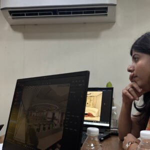
Studio meetings
Courtesy: Greenhatcch Studio

But the kind of authorship people command today comes from stories, places, memories, and preferences of the subconscious mind, something we as designers must relearn to trace and uncover.

What next:

This evolving client archetype demands depth of research, not repetition of clichés. Above all, they remind us why hands-on conversations matter. 

Because while the world makes visuals accessible to everyone, it does not make shared meaning accessible without dialogue.

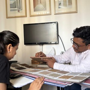
Studio meetings
Courtesy: Greenhatcch Studio

By making visuals, flashy references and widespread information the start, the discussion is allowed to grow richer, turning subsequent solutions into grounded proposals that reward the process and relationship cultivated, perhaps as much as the end result.

Overview:

Greenhatcch has developed an archive of experiences pertaining to clients that push the brief and us in the most pressing but rewarding directions.

A practice that values the voice, its vulnerability and the blind trust it carries, it is the regard of many of these informed individuals that has expanded our scope, our lens of thought and a larger push for us to reach agreeable solutions.

An informed client in 2026 knows what they like, but that presses us to increasingly ask why they like it.

There lies the next step for our evolution.

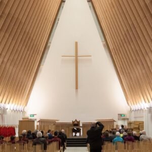
An Offering of Light and Cardboard:

-How a Temporary Cathedral Became a Testament to Collective Resilience


Where the endeavour began:

Some projects begin with operations on scale or site.

But some must respond to discomfort.

Through its incubation, process and even execution, certain ideas evoke a sense of intrigue.

This one challenges the norm unapologetically, flipping the general mass that we constitute when referring to a building.

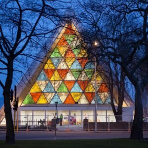
Courtesy: Bridgit Anderson
Project: Shingeru Ban Architects

In Conversation with Shigeru Ban:

From humanitarian shelters to institutional structures, his work has always been a mode of service and attempt to restore dignity for the ordinary.

Even here, his relevance remained philosophical more than formal:

  • Value does not originate in expense.
  • Structural clarity can feel deeply humane.
  • Temporary architecture can carry emotional permanence.


The Experience of Lightness:

What if something associated with packaging could instead hold space? What if light, rather than mass, became the primary building element?

Standing within such a space, one becomes aware of small things. The material feels approachable, almost familiar. 

Yet it has transformed. In strength, stability and its story.

You begin to pay attention and linger differently now.

Other conversations that quietly shifted:

Not every staggering breakthrough has to be vivid to our attention or niche. 

Beyond structural experimentation, the project unsettles a few habits of thought:

  • That durability alone determines architectural worth.
  • That refinement must appear heavy or expensive.
  • That sustainability is a technical checklist rather than a sensory condition.

It also repositioned the scale, influence and impact of craft, enabling a larger population to explore beyond the ‘convention’


A Measured Offering: Overview

By working with cardboard and light, the project reduces itself to essentials — surface, structure, atmosphere. The Cardboard Cathedral was never trying to impress.

It sought to refine the meaning behind its program, in an evolving manner.

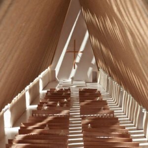
The intention was not to dramatise fragility, but to understand it. If cardboard became the medium, light became the language.


Courtesy: Bridgit Anderson
Project: Shingeru Ban Architects


Smell practiced through Architecture

The Forgotten Sense in Spatial Design

We design for what we see and are able to then converse with.

We refine what we will guide the way of the place.

We measure what we hear and control it to our needs.

But smell has always remained muted in its intentionality, present surely by the simple nature of materials and abundant context that surrounds us. However not as consciously curated as the rest of them.

As architect Juhani Pallasmaa writes, “The door handle is the handshake of the building.”

If touch is a handshake, its scent remains as the afterimage: the trace that lingers long after departure.

Ritual and Fragrance in Indian Homes

In many Indian households, scent structures the flow of the day.

The smoke of incense in the morning.

Camphor during prayer.

Jasmine near a window.

Dried Spices blooming.

A decorated kitchen full of mixed goods and flavours

Closets surrounded by sharp and distinct essence.

Courtesy: Pexels

Architecture could support such moments even at smaller scales: through recessed niches, transitional spaces, or breathable partitions that allow and encourage inhabitants to participate in such activities of diffusion without any confinement.

The Psychology of Scent

Because these plug-ins are not decorative gestures, even the most subtle and non-powering Smell can bypass logic.

It moves directly to memory and emotion. Familiar fragrances signal safety, continuity, belonging.

Ventilation is something designers strive to work with and this can be another passive layer that influences this dimension.

Designing the Invisible

To design with smell is not to artificially scent a space. Material memory, surface ageing and care of your space extends far beyond visual repairs. Oftentimes, a sudden difference in smell appears as the primary hint of an environmental shift.

Courtesy: Pexels

We ask designers to move beyond surfaces and instead engage with the atmosphere they create for this.

Overview

Olfactory design in architecture challenges us to expand spatial awareness beyond what is visible. If scent shapes memory and emotion so powerfully, should it remain incidental?

The question is not whether architecture can influence smell, but how intentionally we are willing to design for it.

Purposeful Hospitality goes beyond a room..

Hospitality begins not with square footage, but rather intent.  In a climate where spaces are heavily curated, measured, and deeply personal how do we make them responsive to temporary and diverse shifts of mood and temperament?

Making Room, even when there isn’t any:

In a setting where every corner already carries function and memory, making room for a guest is more about accommodation — spatially and emotionally.

However, much of the  Indian context sustains in an environment of high-paced rigour and work. Among nuclear families and larger durations outside their personal four walls, even a curated home might make the idea of guests feel like an after-thought.

Yet for some, owing to many reasons, it remains a non-negotiable that often challenges the core assessment of such projects.

Living Compact Realities

The phrase “Atithi Devo Bhava” — the guest is equivalent to the divine — is not decorative rhetoric.

Our present urban reality might feel like a resistance to this generosity. Yet that has only allowed us to evolve our ways of thinking, better integrate layouts and ultimately make the best use of our spaces.

In this environment and economy, dedicating a permanently vacant room to occasional and differing visitors might feel indulgent and a tad bit excluding from the spatial narratives at play.

Hospitality in Multifunctionality:

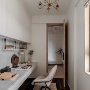
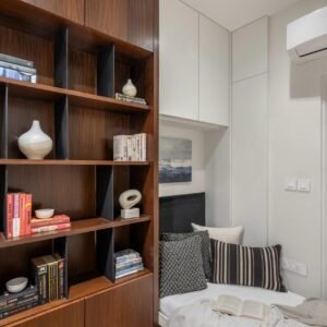
The contemporary guest room now begins to justify its existence in daily actions. No longer choosing to remain a static chamber, it becomes adaptive.

In the absence of guests, it transforms:

  • a study during exam seasons
  • a home office in hybrid work cycles
  • a prayer corner during festivals
  • a yoga retreat at dawn
Studio works
Courtesy: Greenhatcch Studio

Traditional celebratory inspirations:

Historically, in Mughal residences, the Mehmaan Khana functioned in a similar way. (refer for detailed reading)

Despite acting as a defined guest quarter, it spatially integrated dedicated zones for entertaining and hosting visitors without blurring internal family life with public roles.


Designing for Absence as Much as Presence:

These rooms, much like the primary occupiers, become the transitional nodes of the house. Forever in a shifting state of programs, activities and moods, they are designed to perform in an allied fashion for the larger inhabitants of the house.

And at the time a guest arrives, reorient focus and present gracefully when occupied.

Studio works
Courtesy: Greenhatcch Studio

After-thought:

Culturally, emotionally, architecturally, Indian homes are made to always keep room for even sudden and unannounced guests.

This gesture is sustained today by changing a singular destination to a fluid extension of everyday life.

This has allowed for a holistic and truthful integration of the vision from the spatial designers. At Greenhatcch, we’ve often faced these challenges and our clients have always realised the weight of simple yet practical solutions that enhance the quality of life for the house and people from beyond.

‘Cloud Dancer’ moving through lived spaces!

-Beyond neutral: a study in emphasis.


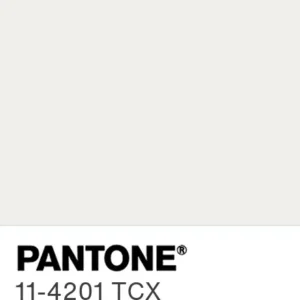
Pantone announced “Cloud dancer” as the colour of the year 2026, with designers, artists and almost everyone showcasing a diverse palette of reactions.

The official release positioned it as a restorative, clarifying white: an atmospheric neutral intended to reflect a collective search for calm and reset. (See Pantone’s announcement on pantone.com.)

This announcement rightfully spotlights the subjective nature of visual elements seen, perceived and felt all around us.

Cloud Dancer
Courtesy: Google images

Is white a choice or the default?

White is often treated as the ‘default mode’. Yet declaring it plainly as “neutral,” risks overlooking the fact that every white carries temperature, density, and reflectivity. 

The question, then, is not whether white is a colour. It is whether we have mistaken familiarity for neutrality.


On Being Selective With Colour:

Paul Rand once remarked, “Design is so simple, that’s why it is so complicated.” 

Selection may appear effortless in a finished product, yet the resolutions and decisions encompassed throughout a creative journey rarely feel simplistic..

Choosing a shade, especially one that seems ‘default’ can often be an act of precision for us.


What does a space want to convey:

It has made for an argument on whether white or a particular variant of it demands a certain attention or simply alters how perception manifests in a space.

Sometimes to expand a volume,

Or to quieten a busy program, 

Or to let material speak first.

As designers, we would have consistently resorted to a certain “white” for countless reasons that alter from brief to brief.

Courtesy: Greenhatcch Studio

Using the right amount of ‘white’:

Often known as an excellently safe yet flexible colour, white and its family have been conscious allies in our decisions.

Cloud Dancer takes a tone typically associated with restraint and becomes a tool for emphasis. It does not withdraw into void; it behaves as a backdrop.

Effectively, this discussion is null without considering the social perception and landscape surrounding colours, which influence our minds and choices subconsciously.

Where Cloud dancer separates is weirdly in its paradox. White often associated with restraint used this way strongly advocates for reasonings and depth of thought.


Going Beyond the Shade:

Certain spaces often make us feel that no other texture, tone or even colour could’ve been tailor-made compared to the present visual, a credit to the designers’ commitment.

The larger perspective extends beyond Cloud Dancer or any singular tone. It questions how we assign roles to colours: when does a surface behave as void, and when does it operate as backdrop?

Courtesy: Greenhatcch Studio

After-thought:

The discussion, therefore, is not about elevating one colour over another. It is about recognising that subjectivity does not negate function.

Cloud Dancer feels familiar because designers have relied on it for years without naming it. Perhaps the real contribution is in prompting us to reconsider and broaden our understanding on what feels effortless.