Not every problem requires a design solution

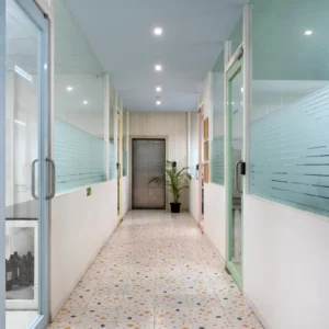
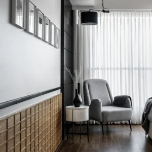
A project often begins with comforting certainty. As designers, our trusted toolkits consist of a site, a brief, a budget, and combining these with experience and insight leads us somewhere in the distance to a finished space waiting patiently to be realised.

At first, most problems appear solvable through design. Afterall, that is what this training incentivises us to think about.

Simple enough. Trusted enough. We too are firm believers in the potential held by intentional, contextual and relevant design. But then the project does begin, welcoming a plethora of newer challenges we end up taking head on.

Some of their outcomes don’t actually call for outcomes that are graphical, data driven or even visual. As timelines unfold, an entirely different category of challenges emerges. But throughout this commitment that we stick to, there simply cannot be a problem that we don’t strive to address and collaboratively resolve.

Too Many Opinions; Too many Expectations

Projects rarely suffer from a lack of ideas. Inspiration that feels grounded to the aspirations presented to us can be gathered from endless sources.

A detailed brief and ambitious stakeholders in fact tend to accumulate ideas. The challenge is rarely generating solutions. It is identifying which voices move the project forward and which simply add volume to the conversation.

Sometimes, the final drawing ends up acting as a collage of the ideas that sprouted along the way: Sometimes it resembles none of them, instead turning into a profound resolve that learned from everything that came from the previous iterations.

We might be the one designing, yet it is ultimately the clients that recognise when a drawing is “final”. The way we manage preferences softly also drives forward the pace of this.

The Rarely Understood Time

Time behaves differently for everyone involved. Some projects already arrive with a stopwatch. Whether as an emergency, a non negotiable or a situation that in turn actually narrates the brief.

Certainty, especially in such situations becomes desired. A contractor needs decisions, consultants require coordination, and procurement follows its own calendar entirely.

Many design decisions are not about what should happen, but when it should happen. When we pick up a project, we come with an understanding of being answerable. Clients might not be able to grasp the pace of design, even less the pace of actual construction. Besides that, although time moves the same way for all, we all often fall under very different sets of the 24 hour clock.

Creating alignment towards locking decisions becomes a necessary perspective we introduce. This however is not an excuse for compensating in the final output, rather a larger pressing challenge.

The Maintenance Problem

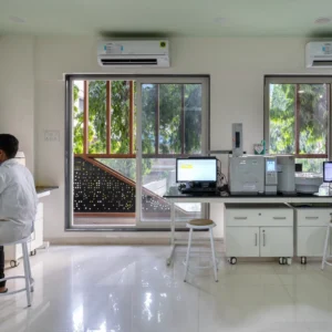
Every project imagines a perfect future version of itself. Reality introduces cleaning schedules, wear and tear, replacements, servicing, and daily use.

Our roles follow a very complicated curve across the axis of time. While we stay incredibly involved with a project across both its design and building life cycle, we take a sharp dive in presence once the space is ready to welcome its host.

We have curated an experience that spans generations of use, adaptation and activities. We understand its limitations, potential and probable issues that could sprout with time.

It is us who inform, demonstrate and translate a very transparent view of the outcomes that we handover.

The “Architect, Fix It” Problem

At some point, every challenge arrives at the architect’s desk.

Budget concerns. Coordination gaps. Scheduling conflicts. Communication breakdowns.

Not because they originated there, but because the architect often sits at the centre of the conversation.

The role quietly expands from designer to translator, mediator, organiser, and occasionally therapist.

What Happens Beyond the Drawings

This is where much of the profession actually operates. Through alignment, communication, sequencing, expectation management, and countless decisions that never become visible in the final space.

The irony is that some of the most valuable architectural work is precisely what disappears from view. Not every problem requires a design solution. And perhaps that is one of the profession’s lesser-known responsibilities.

While architecture may be represented through drawings, it often progresses through conversations, judgement, coordination, and restraint. The finished space reveals what was built.

But the process rarely reveals everything that was resolved to get there. Oftentimes, we’ve realised how what was discarded was perhaps just as meaningful to the service we offer.

Storage with storytelling

Storage space or the simple act itself needs an anchor. The space before anything must breathe life and this life in turn demands room and classification.

If the temporal space is made of physical elements, the storages are a skin, self adjusting, evolving and dynamic.

Which raises a fair question: can it really be reduced to a purely utilitarian role?


Storage Is Not Secondary

Roy Residence
Courtesy: Greenhatcch Studio


It often enters conversations late, tagged onto drawings once the “real” design feels complete. 

But step into a well-resolved kitchen, a retail back-of-house, or a wardrobe spine, and the truth reveals itself: storage has already organised the plan. Good order and alignment is often the make or break here.

It dictates edges, depths, and decisions long before finishes arrive. The elevation works because it is visually pleasing and functional. 

Storage cannot be relegated to a smaller role when certain space requires it in the volume that we are used to.


Designing for Behaviour, Not Objects


In kitchens, it is the sequence of cooking, cleaning, and reaching. In closets, it is daily routines: through simple questions such as what is accessed first, what is stored away, what remains in transition. Utilities follow cycles of use, not static placement.

Morning rushes, absent-minded drops, repeated reach patterns shape access far more than dimensions ever will. Good storage anticipates this choreography. It reduces friction, not just clutter. 

Good storage anticipates this choreography. It reduces friction, not just clutter. 

We like to believe we are storing things. In reality, we are designing for habits.


The Myth of More

More storage feels like more control. Until it isn’t. Introduce the “induced demand” and how giving more in one way would just invite more of what was to be resolved.

Excess breeds dead zones, forgotten corners, and visual fatigue. It is then that precision matters more than volume. 

Knowing what must be within reach, what can recede, and what should never have existed in the first place. Architecture condenses experience into interior spaces and these products or furniture are even smaller but deeply ingrained mediums of this experience.


Clutter Is a Design Brief

PASSADDAHI HOUSE
Courtesy: Greenhatcch Studio


Clutter is rarely accidental. It is evidence of routines that might become unaccounted for, and transitions that are unresolved. 

To an extent, users can shy away from the problem. Perhaps cluttering is a space planning problem influenced by our behaviour.

In that case, designing storage is less about eliminating mess and more about absorbing it gracefully. Planning for the inevitable, not the ideal.


Framing Space, Not Just Filling It

Roy Residence
Courtesy: Greenhatcch Studio

Storage quietly defines spatial hierarchy. It draws boundaries between public and private, conceals what must remain backstage, and reveals what deserves attention. In doing so, it becomes an architectural tool, not just furniture.

Cabinetry today carries more than belongings. It absorbs appliances, wiring, and services, resolving technical demands without disrupting the visual field. These integrations often go unnoticed, which is precisely the point.

In the end, storage is about calibration, of use, of movement, of visibility. When done well, it disappears into the experience while holding the entire space together.

Designing for transitional spaces and in between moments

Transitional spaces are often restricted to circulation: paths that move people efficiently from one point to another. 

Way larger buildup to this statement. Establish a premise of being given a space that allows halting but not comfort. Or perhaps a space that provides comfort with relatively less amount of halting.

Yet, within this movement lies an overlooked distinction: the difference between a temporary pause and a pause point.

So really, what’s the difference?

Which ones do designers choose and where?

Between wavering and halting:

A temporary pause is incidental. It occurs out of necessity, waiting, passing, adjusting pace. It is brief, functional, and often unsupported by the space itself.

A pause point, however, is intentional. It is designed to hold presence. It invites occupation without demanding it. These are moments where movement slows down not by constraint, but by choice.

Chemotest Office
Courtesy: Greenhatcch Studio

The difference lies in how space chooses to respond to behaviour.

Anticipating the informal:

A pause point is never incidental in planning.

It can arrive from a place of regulations, crowd control or even as a buffer in a long chain of programs.

It need not be defined by boundaries. When circulation initiates with a larger subset of people, a nook or small niche of any space acquires a sort of informal nature to its existence.

The role of a designer is to anticipate how people redefine an area beyond its designated label.

Efforts then go into ensuring there is no resistance to such behaviour and at the same time, these surges of dynamic activities do not hinder the safety or functional non-negotiables  

How we contribute:

Pause points are identifiable through subtle spatial cues. Slight expansions in width, shifts in light, changes in material, or the introduction of edges that can be leaned against or sat upon. These gestures signal possibility. 

They acknowledge that movement is not always linear—it can pause, overlap, and engage.

In contrast, purely transient corridors resist occupation, of all kinds. Their proportions remain tight, their surfaces continuous, their intent singular. They prioritise flow, often at the cost of interaction.

Environmental graphics help tremendously. These include colour, texture, signages and similar forms of legible representation at giving life into a liminal area.

Chemotest Office
Courtesy: Greenhatcch Studio

It makes pausing, an interesting and worthwhile experience: pulling all outside of the micro climate and pace of work.

But the opportunity lies in blending these two conditions. Not every corridor must become a destination, but neither should it reject life entirely. By embedding moments of pause within movement, transitional spaces begin to operate as social buffers.

A widened threshold near an entry can allow a conversation to unfold without interrupting circulation. A spill-out zone from a workspace can encourage informal exchanges. Even a change in ceiling height can create a subconscious cue to slow down.

The emotional quotient: 

Perhaps they are an act of rebellion.

We’ve seen staircases turn into effective meet-ups for socialising.

Breaks, small spill overs or even controlled gathering at one point and suddenly providing just the right amount of privacy for a personal call or occupation.

Codes ensure ventilation and light never feel inadequate here. Users then associate a different ownership to such areas thereafter.

Such spaces become active without being over-designed. They host interactions that are unplanned yet essential: brief conversations, moments of reflection, or simple observation.

Chemotest Office
Courtesy: Greenhatcch Studio

Overview:

Such is the paradoxical nature. At any point of time, whether as a group or through a singular arrival, the passing of time is imminent. 

Users will remain in tune that they can waver, but not remain here. As designers, smaller touches only encourage this nature more.

When pause points are carefully introduced within systems of movement, corridors and foyers evolve beyond connectors. They become environments that support the social rhythm of a space efficiently and with purpose.

The art of zoning in luxury residences

Luxury, in style, ambience and experience often speaks for itself.

Among architects and clients, it is self serving and often a popular choice as it exemplifies a curate storytelling experience.

It makes a home a proud and welcoming host. Even in modern iterations, luxury has elements that remain deeply embedded with treatment: of the bounds of room and the way we journey from one to another


Luxury Begins in Plan

In residences, we often associate it with finishes and visual richness.  Grandeur and glamorous perhaps.

But is it truly restricted to giving new life to the structural members and husk of a room?

As interior designers and architects, we are given a certain level of flexibility and an early involvement in realising the client vision.

Luxury begins right from here.

Even before a material is selected.

Or a detail finalised.

Even discussed through visuals.

Excess doesn’t exemplify luxury but restraint also isn’t an easy task to execute.

Yet, its true foundation lies in planning. Before materials are seen or touched, a home is first experienced through how it is entered, navigated, and understood.


Beyond the Framed View

While expansive views and refined elevations frame aspiration, they are only a part of the narrative. 

Luxury extends beyond what is immediately visible. This is another way of not restricted a style to become visually focused.

It is not just about what a space looks like, but how gradually and meaningfully it reveals itself over time.

Roy Residence
Courtesy: Greenhatcch Studio

A journey through the house becomes that of control and comfort.

Of showcasing what matters and allowing the room and expanse to serve as background.


The Unseen Language of Space


Zoning becomes the silent framework behind this experience. 

Public, semi-private, and private realms are not merely divided, but sequenced. Transitions make use of the existing volume. 

They are more than connectors of different rooms.

They are barriers, soft gradients of privacy and at the same time elements that stretch the interiors.

A vast empty apartment might not qualify as a pristine space, however every luxurious space makes the volume expand.

Spaces become layered, allowing the same transitions to feel natural and part of 2 bounding rooms at the same time.

Rather than being abrupt boundaries they extend the story further. 

This invisible structure creates clarity without announcing itself.


Choreographing Movement

Movement within a well-zoned residence feels intuitive. Distances are elongated to create depth, yet never to the point of fatigue. 

The Woven house
Courtesy: Greenhatcch Studio

Orientation further refines this journey, aligning spaces with light, views, and time, allowing the home to respond to its environment.


Moments That Invite Pause

Within this flow, smaller details begin to hold value. A window-side niche, a widened passage, a subtle shift in material or light—these become moments of pause. 

Roy Residence
Courtesy: Greenhatcch Studio

They do not interrupt movement, but gently slow it down, offering reflection within transition.


An Orchestrated Whole

Luxury, then, is not defined by singular gestures, but by continuity. It resides in how spaces connect, how movement unfolds, and how experiences are layered. 

A well-zoned home does not simply contain life: it composes it, with precision, restraint, and intent.

Architects wear too many hats!

An architect rarely introduces themselves as anything beyond their title.
Yet, somewhere between the first meeting and the final handover, a wardrobe begins to form.


The Listener

Present before the designer.
Sitting across a table, decoding not just requirements but hesitations, ambitions, and the occasional contradiction that slips between sentences.


Briefs are rarely given; they are revealed.


The Negotiator

Not in dramatic exchanges, but in calculated pauses.
Between budget and aspiration, urgency and patience, what is said and what is truly meant.
It is less about winning and more about aligning without friction.


The Translator

Converting drawings into conversations,

ideas into reassurance,

and complexities into something approachable.
Language here is not technical. It simply cannot even afford to be.

translation at times becomes our very bread and butter, between resolving the most complex constraint to even perhaps selling something in an avant-garde fashion!


The Mediator

Quietly holding space between differing opinions.
Client and contractor, vision and feasibility, expectation and reality.
The task is not resolution alone, but maintaining trust while arriving there.


The Optimist

On days when timelines stretch or decisions stall, this voice steadies the process.
Not loudly, but consistently.


The Observer

Stepping back, reading the room.
Understanding when to speak and when to allow silence to do its work.


None of these roles are formally assigned.
They are assumed, adapted, and often discarded within the span of a single conversation.

They say an architect wears too many hats already, but too little in colours.
We disagree.

Because beyond drawings and deliverables lies a spectrum of negotiations, adjustments, and reflections… sometimes even with oneself.

The drawings may define the space,
but it is these unseen roles that shape the process.

Building Luxury without a precious collection

Decoding the term:

Luxury, for the longest time, was easy to identify.

Arriving aloud and polished 

Often presenting as unmistakably present.

And lingering beyond the room through thoughts, displays, recommendations and conversations…


Story so far:

Over the last few decades, however, the very idea of luxury has expanded. We certainly feel that perhaps it has happened too quickly. It has moved from being a condition of making to a style of display. 

Amplified by media and accelerated through digital platforms as some sort of movement, it often appears as an orchestral composition of abundance: 

More materials, more layers, more visual cues competing to signify value.

More = Luxurious quickly became the norm even before it was put to the stand.


OBJECTS over experience:

We try to gauge why this occurred in the first place. The architectural practice today does a profound job at intersecting with other domains of design.

For the sake of convenience, or the larger justification of a program or lying somewhere within the briefs, we as design curate fuller visuals for a space.

Designs we spend time on become living performances sometimes, with every element functionally interacting with the users in the decoded style.

Here is where objects intervene into the picture. 

Bounding rooms we design contain the experience…

While objects within them simulate that very play, through activities, narrations and simple observations sometimes.


Necessary revisions:

In this landscape, luxury risks becoming legible at a glance but forgettable in experience. When everything speaks at once, very little is actually heard.

But what if luxury did not rely on accumulation?
What if it was allowed to be quieter, more deliberate, even slightly withheld?

A different reading begins to emerge, one where restraint becomes the primary tool. 

Where the absence of excess is not a compromise but a position. Here, materials are chosen not for their immediate impact, but for how they age, how they settle, and how they participate in the life of the space over time.


What luxury signals 

While it is natural to incline towards these definitions, luxury doesn’t ever have to be synonymous in excess. Observing restraint, both in composition and additions to the space allows for a much more singular and refined story to unfold. 

Some of our clients have helped us perfect and grow into this very understanding.

The Roy residence remains a prime example of this practice.

The Roy Residence
Courtesy: Greenhatcch Architects

Repetition of trusted elements goes beyond materials.

The story we chose to share works through textures, rich quality and sophistication. The common gathering is pristine not because of its objects around, but because it exemplifies the space and the negative masses.

Taller head-rooms with patterned ceilings add clean lines to a layout of rich contrast in materials and surfaces. More importantly the project doesn’t endorse the idea that luxury needs to be densely filled or crowded to shine through.


Redefining with context:

This version of luxury does not avoid richness; it redistributes it. Into proportion, into detail, into the way light meets a surface or how a junction resolves without calling attention to itself. It values clarity over decoration, continuity over contrast, and intent over indulgence.

In many ways, it asks for more discipline than display ever could. To hold back, to edit, to trust that a space does not need to prove itself instantly.

The Roy Residence
Study
Courtesy: Greenhatcch Architects

Timelessness, then, is not a visual outcome but a behavioural one. It is embedded in decisions that remain relevant beyond the moment they were made.

Perhaps the real shift lies here:

Luxury is no longer about what is collected, but about what is consciously left out.

Trends we’re watching closely

Trends in the design industry are little instances of styles that turn up, turn heads, and either stay or fade away through interpretation.

At our studio, we don’t really chase a specific industry trend, as we believe that briefs come with unique constraints, requirements, and declarations that eventually frame a process sufficient enough for design goals.

We do, however, keep a watch on these smaller shifts in the industry, decoding what they truly signify about preferences, behaviours, and spatial aspirations.


EXPRESSIVE SKIRTING + WAINSCOTING:

Introducing a little surprise of thickness and texture, a simple layer of cladded material often becomes a statement highlight to any bounding room.

At the studio, a large bold wall might be the canvas, but these elements define the necessary negative space before layers of visuals begin to weave a story.

What typically has been a protective technique against wear and tear also becomes our guiding tool for the eye and a storytelling device for the mind.

Roy Residence
Courtesy: Greenhatcch Architects


STATEMENT LIGHTING:


Lighting will always remain a conscious investment, powerful enough to completely alter moods.

It is always a performance, with control over placement, intensity, hue, and even the sculptural aspects of the fixture.

Because we have always been familiar with emitters being harmoniously attached to our surfaces and above the typical visual level.

Today, statement lighting reminds every visitor about its drama, performance, and the smaller dialogues it creates with the material of the space, even without illumination.

The Ivory Fork
Courtesy: Greenhatcch Architects


NEUTRAL AND MUTED PALETTE:

We endorse a finished look that is grounded in restraint. That is because we understand the intricacies that go into its arrival.

Perhaps there are certain realities in industry practice where design is not observed in such a detailed fashion. Yet, this is not a flaw of these tones, but rather a validation of the chosen and safe fallback they act as.

These are palettes that shed light and focus on other elements without appearing blank. They make room, visually and sensibly, to match the mood and temperament of the space meant to serve.

We prefer these in quieter spaces, signalling privacy, calm, and pause that is deeply personal. They ultimately allow small sightings of the room to take the lead while holding everything together.

Somehow, but surely, the neutral palette is no longer simply neutral in what it gives to the space.

Chemotest Office
Courtesy: Greenhatcch Architects


OBJECTS AS DECOR:

We enter spaces where interior design fundamentally integrates with all forms of lifestyle, routines, and behavioural traits.

Shared spaces have always been a home’s pride—a stage of display, status, and choreographed living.

Objects carry anecdotes, mood boards, and interactions, bringing a certain composition that architects or spatial designers alone would take too long to evoke.

They become living entities and rightful stakeholders of the rooms, while also, strangely, never filling the room.

The stories they carry must, of course, require a space to be heard. They are interruptions done organically, through elements that can be carried from home to home.

Brochures of history shared within the inhabitants.

The Woven house
Courtesy: Greenhatcch Architects


TEXTURED CABINETRY:

Our country thrives in craftsmanship. Handmade goods and objects carry skill, love, culture, and a strong element of care.

They are little nudges and nooks that add character to the space. The act of cleaning them attaches us closer to their making and place of origin.

We appreciate the stories they come with, and so does the space. Modern luxury is rooted in a form of consumerism that validates its creator and birthplace.

In a world where mass production of fittings and cabinetry has made what we overlay far more accessible, desires shift towards utility that does more than function.

Passaddahi House
Courtesy: Greenhatcch Architects


OVERVIEW:

Some emerged from functional challenges, some derivatives of larger aesthetic and symbolic criteria.

A few of these have become techniques and tools we admit to having developed a personal liking for as well.

They end up reflecting the endless nature of the industry, as opposed to the filtering and carving of a niche that we, as architects, often pursue.

Today, we share a smaller glimpse into the executed experiments of the studio through the guise of five directions..

Each carrying its own weight, charm, and character.

First 30 Seconds at the Reception

The first thirty seconds inside a space never feel long, yet the lingering impression they carry cautiously influences the tone and nature of the visit that follows.

India has witnessed a vivid growth spurt in business over the last decade. Emerging founders, entrepreneurial opportunities, coworking spaces, and even temporary commercial hubs have found ways to develop.

Be it a suspicious-looking building or just another glass-box skyscraper, we rarely gauge the character of an office solely through its façade.

Beyond referrals, websites, and conversations with affiliated parties, something about the space drew us to its physical address. That first impression served its purpose: inviting fresh eyes and curious movement.

Sufficient for entry. But now the space must step up. What, then, becomes the new logo for a commercial venture?


Welcome aboard:

Experience is everything. Even within a limited span of time, it holds the power to shape opinions through the moods and feelings we perceive.

The reception area is where everything condenses into a singular moment. Intent, pause, etiquette, and inquiry all converge here. 

It becomes a display of the host to the guest, signalling preparedness: not just of the room, but of the people who inhabit the larger environment.

These individuals have curated this threshold for varied encounters, all leading to dialogue.

Upon arrival, the goal is to forget what could not be controlled: dense contexts, repetitive commercial clusters, or unremarkable entries. Whether these worked or not, the reception should not let them define the experience.


Reading between the lines:

This threshold is far from passive. Though often treated as a pause point, the way one enters, waits, or is guided forward begins to shape interaction. It subtly informs body language and expectation.

Hierarchy is inherent to office environments. At entry, the guest and host form the primary dynamic, while objects occupy a secondary role.

Hospitality here exists even without conversation. Proportion, material, light, and spatial language have already been spoken from the first moment.

No interaction is in itself an interaction when every impression is calculative. 

How much a reception unveils about the larger office, how much it chooses to mask to create a self-contained room, what are the bounding lines in this domain are valuable questions that make this a miniature design esquisse during an interior proposal.


Are we doing just enough?

Accessibility of all forms becomes explosive.  The more your space feels accommodating, the faster time naturally dissolves without inducing any negative bias. 

The next time you find yourself at a reception: behind the desk or in front of it, observe how naturally the space operates. It often reflects a glimpse of what a first-time visitor might feel.

The next time you are positioned at the reception, behind the desk or right in front of it, a simple check of how natural the space feels can gauge a lot about what a stranger would perhaps feel coming there. 

But comfort must be temporal here. 

A seated participant is an active call to action: not just to the reception spokesperson but the entire layout. Unknown Intent coming from anyone is uncertain but can never be gambled with from an economic standpoint.


Chemotest Office:

Testing labs typically come with a clean, medically sound design language. Emotionally, visitors often come from a place of inquiry, consultation and associated tasks. 

At Greenhatcch Architects, the entry envisioned a bright and warm welcome within the compact space. Material finishes were at the forefront of the structural elements as well as objects and furniture existing in this area. 

The side wall reinforces confidence and trust through statistics and testimonials but before that, the space is already offering a much more lively welcome and halt by the wide reception.

Wooden finishes gradually unfold to the working areas creating a smoother transition along with fluid tile work ensuring a pause that doesn’t turn to a lingering stop 

Design must respect time without eliminating pause.

Spaces should engage without distracting from purpose.
Accommodation must offer respect over indulgence.
Transitions should feel fluid, not abrupt.


Even in departure, the space leaves behind a subtle residue of comfort. A reminder that in environments defined by precision, design can still make room for reassurance.

Chemotest Office:
Entry + Reception
Courtesy: Greenhatcch Architects

Overview:

In these brief moments, design reveals its sharpest understanding—not of theory, but of people, behaviour, and intent.

Spaces that rely on excess often mask sterile environments that fail to balance hospitality with momentum.

The first thirty seconds at a reception can shift from fleeting to lasting only when storytelling resonates on both ends—drawing from the values a company upholds and translating them into spatial strategies with clarity and honesty.

Our endless pursuit of Detail

Architecture is often understood through its visible outcomes

Bold and inspiring forms,

Experiential use of scale, 

Ingenious experimentation in material. 


Yet for a deeper analysis and engagement, we return elsewhere. Behind every resolved surface exists a layer of decisions, where intent is negotiated through precision. It is here, in the pursuit of detail, that design begins to reveal its discipline.

The eye level, our extent through the hands and legs and environment around us allows us to interact with a calculative composition of joineries, complexities, modularity and assemblies. 

Sometimes we do express these technicalities visually, otherwise preferring quieter and simpler finish surfaces. What remains in both cases is their functional and aesthetic contributions.


Designers First: 

Our training equips us to interpret the world with a layered lens,

Decode key problems,

Develop a mind rooted in trial and error,

Deploy productive solutions.


This iterative mindset extends across creative disciplines. As architects, however, we often begin at an unusual point: the finer grain. By resolving edges, junctions, and sequences early, we construct a larger clarity. The macro is frequently a consequence of how precisely the micro has been understood and addressed.


Because Simplicity ultimately takes efforts: 

The pursuit of detail is not always a matter of perfection, but of clarity. Drawings afterall must become grounded and feasible realities.

Design is the alchemy of turning speculated solutions into workable prototypes that can be replicated under set instructions. When drawings are largely tested against reality, inherent assumptions are refined, and restraint becomes a discipline. 

Design styles are a good example of this. Showcasing complexities of construction is not a bad design call but neither is forcefully masking it.

The end motive is always in achieving a complete process. One that ticks major prerequisites.

RoyResidence
Skirting & Panelwork
Courtesy: Greenhatcch Architects

Sometimes about the texture, sometimes the aspirations, sometimes a translation of the moodboard. Here, the success of a space lies not in what is added, but in what is deliberately held back.


What drives this thinking: 

This pursuit may seem endless, even obsessive at times. Yet it is this very rigour that allows architecture to move beyond assembly.

Detailing transforms construction into intention: ensuring that what is built carries complete coherence, longevity, and resolution that goes beyond early impressions.

And yet, for all its rigour, detail carries a quiet irony. The better it is resolved, the less it demands attention. It slips into the background, doing its job so well that it almost disappears. Perhaps that is the real test:

Not to be seen, but to be trusted.

CHEMOTEST OFFICE
Jali Pattern
Courtesy: Greenhatcch Architects

Who has the most stake involved: 

Funnily enough, the intent as discussed can largely vary with the briefs. The value of detail often shifts depending on who is observing it. 


What may feel critical to the designer can appear minimal, even invisible, to the end user.

This is not a rejection or a failure on part of the detail. This is its nature. 

The Ivory Fork
Ceiling Recess Lights
Courtesy: Greenhatcch Architects

Rather, most users cannot read the relevance of individual components from a composition of cabinets, fixtures, claddings, lights, recess and more unless directly subtracted from the view.

These moments might appear in final photographs, or might not even directly be the point of focus ever yet remain fundamentally functional to the living ecosystem.

“Good design is obvious. Great design is transparent.” — Joe Sparano

Invisible design operates precisely in this realm. It does not demand attention, yet it governs comfort, usability, and coherence.

Detail, therefore, is less about being seen and more about being experienced, subtly reinforcing the relationship between user and environment without ever interrupting it.


Overview: 

There is an invisible labour embedded in this process. Hours spent resolving a corner that may never be consciously noticed, iterations that refine a line by millimetres, conversations that weigh aesthetics against performance. 

It is a duty we as Architects abide by. Starting as a conscious decision, it becomes second nature to any designer. To get to the bottom of every task in its rawest and most minute form possible.


To engage in a dialogue at this platform. Between ideas and materials. Its dimensions and perception. All of this done irrespective of the audience. 


In many ways, detailing becomes a form of authorship. It reflects how carefully a designer listens to the material, the context, and the brief. This becomes the biggest commitment.

Architecture lingers in the ease of use, the comfort of occupation, the absence of friction. And somewhere within that effortlessness lies the outcome of an endless, often invisible pursuit.

When did Glass become the default?

Glass today is rarely questioned. What appears as the obvious choice for façades pretty often extends to partitions, offices, even homes. But this rampant “default” is surprisingly relatively recent.

Today it signals many things, often in a not so transparent but somehow inherent manner, often without interrogation.

Somewhere along the way, we feel its adoption became less of a choice and more of an inheritance.

Origins 

The architectural use of glass expanded dramatically with industrial advancements in the 19th century. The Crystal Palace (1851) demonstrated how glass could move beyond openings to become an entire structural skin.

Image source: Wikipedia

References like Transparency: Literal and Phenomenal by Colin Rowe and Robert Slutzky, and essays on ArchDaily and RIBA Journal, further trace how glass evolved from innovation to ideology, eventually embedding itself as a global architectural language.

In India, the proliferation of glass façades accelerated alongside liberalisation and globalisation in the 1990s and early 2000s. Corporate architecture began aligning with international aesthetics, supported by a rapidly expanding ecosystem of façade engineering, glazing systems, and material supply chains.


Through Symbolism and Meaning 

Glass has been given a voice to represent more than enclosure. 

Earliest renditions began to signal openness, progress, and institutional transparency. Buildings like Seagram Building framed corporate clarity, while the Apple Park uses glass to dissolve boundaries between inside and outside.

Yet psychologically, constant visibility alters how we occupy space. Transparency, when continuous, can feel less like openness and more like exposure, quietly reshaping behaviour, comfort, and spatial hierarchy.


The Contradiction 

Despite its visual lightness, glass often performs poorly in many climates. High heat gain, glare, and dependence on mechanical cooling create long-term inefficiencies. 

Image source: Pexels
Courtesy: @Arefin Shamsul

In the Indian context, fully glazed façades frequently contradict climate-responsive design principles, especially in regions with intense sunlight, where comfort is achieved not through exposure, but through calibrated protection.


What’s Being Ignored

The persistence of glass is far from accidental. It is supported by industry, familiarity, and aspiration.

Most importantly, decades of efforts fueled into refining accessibility and procurement.
This reliance has grown strong enough to sideline more nuanced, climate-responsive approaches.

There is a certain inertia at play. Questioning glass means rethinking systems, and that shift, while necessary, is rarely immediate or convenient.


Larger Dilemma:

Rather than focusing solely on replacing materials, the opportunity lies in rethinking spatial strategies.

While the glass industry operates at a massive, established scale, meaningful change does not always require dramatic material shifts. It begins with design intent.

Image source: Pexels
Courtesy: @Pixabay

If commercial spaces can move beyond flat visual statements and engage with section, layering, and climate, the expression of architecture becomes richer, more responsive, and less dependent on a single material narrative.


Overview:

Modern need not translate to uniform, reflective skins. True modern thinking is responsive, contextual, and efficient. The widespread use of glass today suggests a drift toward visual sameness rather than innovation.

Perhaps the more relevant question is not whether glass works, but whether we are still actively choosing it. Or have these decisions become inherited defaults: 

Repeated across projects without pause, simply because they have long been accepted as the norm?