Decoding the term:
Luxury, for the longest time, was easy to identify.
Arriving aloud and polished
Often presenting as unmistakably present.
And lingering beyond the room through thoughts, displays, recommendations and conversations…
Story so far:
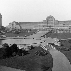
Over the last few decades, however, the very idea of luxury has expanded. We certainly feel that perhaps it has happened too quickly. It has moved from being a condition of making to a style of display.
Amplified by media and accelerated through digital platforms as some sort of movement, it often appears as an orchestral composition of abundance:
More materials, more layers, more visual cues competing to signify value.
More = Luxurious quickly became the norm even before it was put to the stand.
OBJECTS over experience:
We try to gauge why this occurred in the first place. The architectural practice today does a profound job at intersecting with other domains of design.
For the sake of convenience, or the larger justification of a program or lying somewhere within the briefs, we as design curate fuller visuals for a space.
Designs we spend time on become living performances sometimes, with every element functionally interacting with the users in the decoded style.
Here is where objects intervene into the picture.
Bounding rooms we design contain the experience…
While objects within them simulate that very play, through activities, narrations and simple observations sometimes.
Necessary revisions:
In this landscape, luxury risks becoming legible at a glance but forgettable in experience. When everything speaks at once, very little is actually heard.
But what if luxury did not rely on accumulation?
What if it was allowed to be quieter, more deliberate, even slightly withheld?
A different reading begins to emerge, one where restraint becomes the primary tool.
Where the absence of excess is not a compromise but a position. Here, materials are chosen not for their immediate impact, but for how they age, how they settle, and how they participate in the life of the space over time.
What luxury signals
While it is natural to incline towards these definitions, luxury doesn’t ever have to be synonymous in excess. Observing restraint, both in composition and additions to the space allows for a much more singular and refined story to unfold.
Some of our clients have helped us perfect and grow into this very understanding.
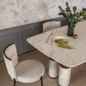
The Roy residence remains a prime example of this practice.
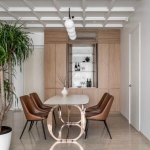
Courtesy: Greenhatcch Architects
Repetition of trusted elements goes beyond materials.
The story we chose to share works through textures, rich quality and sophistication. The common gathering is pristine not because of its objects around, but because it exemplifies the space and the negative masses.
Taller head-rooms with patterned ceilings add clean lines to a layout of rich contrast in materials and surfaces. More importantly the project doesn’t endorse the idea that luxury needs to be densely filled or crowded to shine through.
Redefining with context:
This version of luxury does not avoid richness; it redistributes it. Into proportion, into detail, into the way light meets a surface or how a junction resolves without calling attention to itself. It values clarity over decoration, continuity over contrast, and intent over indulgence.
In many ways, it asks for more discipline than display ever could. To hold back, to edit, to trust that a space does not need to prove itself instantly.
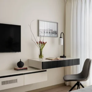
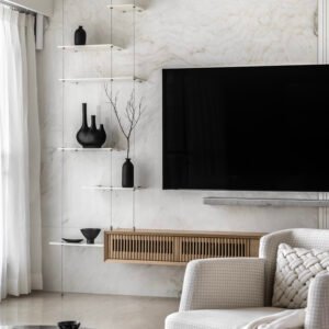
Study
Courtesy: Greenhatcch Architects
Timelessness, then, is not a visual outcome but a behavioural one. It is embedded in decisions that remain relevant beyond the moment they were made.
Perhaps the real shift lies here:
Luxury is no longer about what is collected, but about what is consciously left out.