-Beyond neutral: a study in emphasis.
Pantone announced “Cloud dancer” as the colour of the year 2026, with designers, artists and almost everyone showcasing a diverse palette of reactions.
The official release positioned it as a restorative, clarifying white: an atmospheric neutral intended to reflect a collective search for calm and reset. (See Pantone’s announcement on pantone.com.)
This announcement rightfully spotlights the subjective nature of visual elements seen, perceived and felt all around us.

Courtesy: Google images
Is white a choice or the default?
White is often treated as the ‘default mode’. Yet declaring it plainly as “neutral,” risks overlooking the fact that every white carries temperature, density, and reflectivity.
The question, then, is not whether white is a colour. It is whether we have mistaken familiarity for neutrality.
On Being Selective With Colour:
Paul Rand once remarked, “Design is so simple, that’s why it is so complicated.”
Selection may appear effortless in a finished product, yet the resolutions and decisions encompassed throughout a creative journey rarely feel simplistic..
Choosing a shade, especially one that seems ‘default’ can often be an act of precision for us.
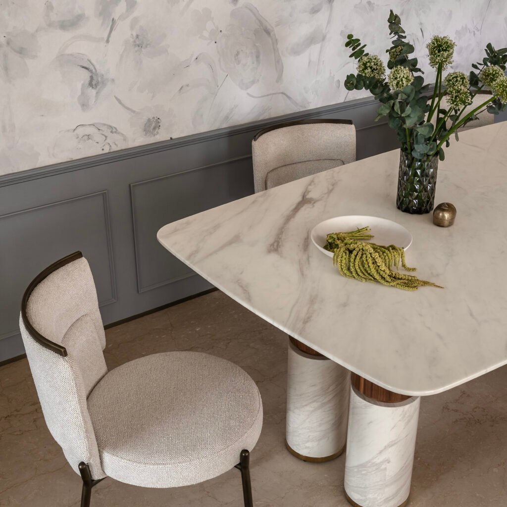
What does a space want to convey:
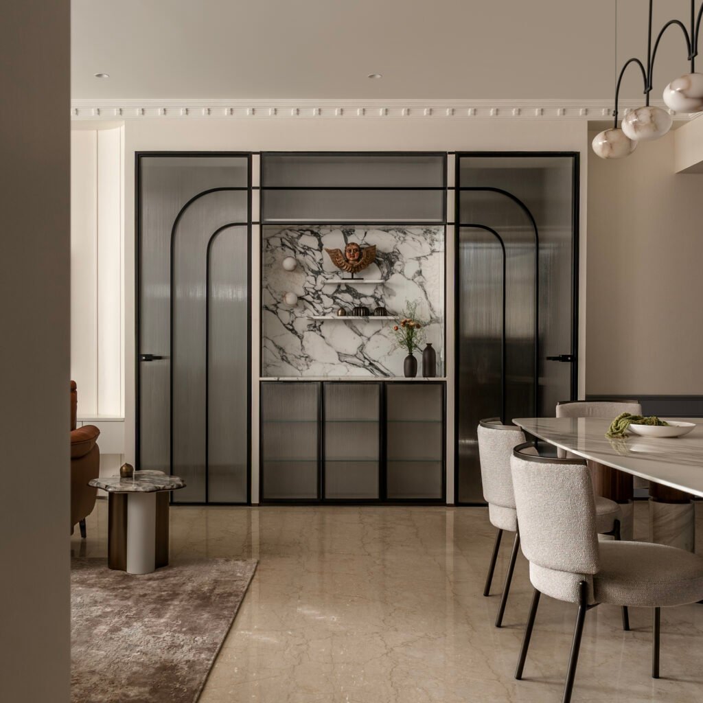
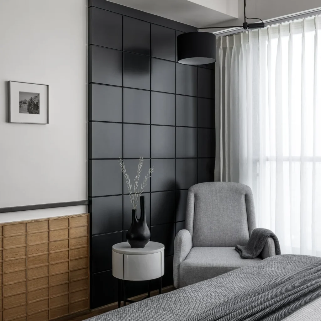
It has made for an argument on whether white or a particular variant of it demands a certain attention or simply alters how perception manifests in a space.
Sometimes to expand a volume,
Or to quieten a busy program,
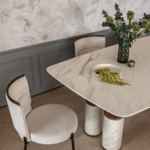
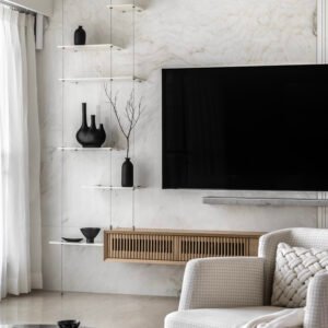
Or to let material speak first.
As designers, we would have consistently resorted to a certain “white” for countless reasons that alter from brief to brief.
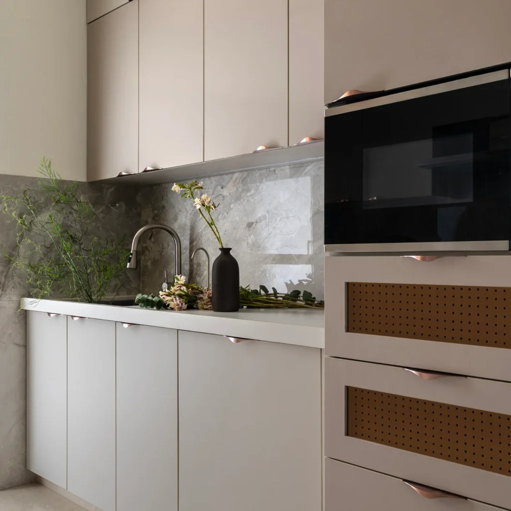
Using the right amount of ‘white’:
Often known as an excellently safe yet flexible colour, white and its family have been conscious allies in our decisions.
Cloud Dancer takes a tone typically associated with restraint and becomes a tool for emphasis. It does not withdraw into void; it behaves as a backdrop.
Effectively, this discussion is null without considering the social perception and landscape surrounding colours, which influence our minds and choices subconsciously.
Where Cloud dancer separates is weirdly in its paradox. White often associated with restraint used this way strongly advocates for reasonings and depth of thought.
Going Beyond the Shade:
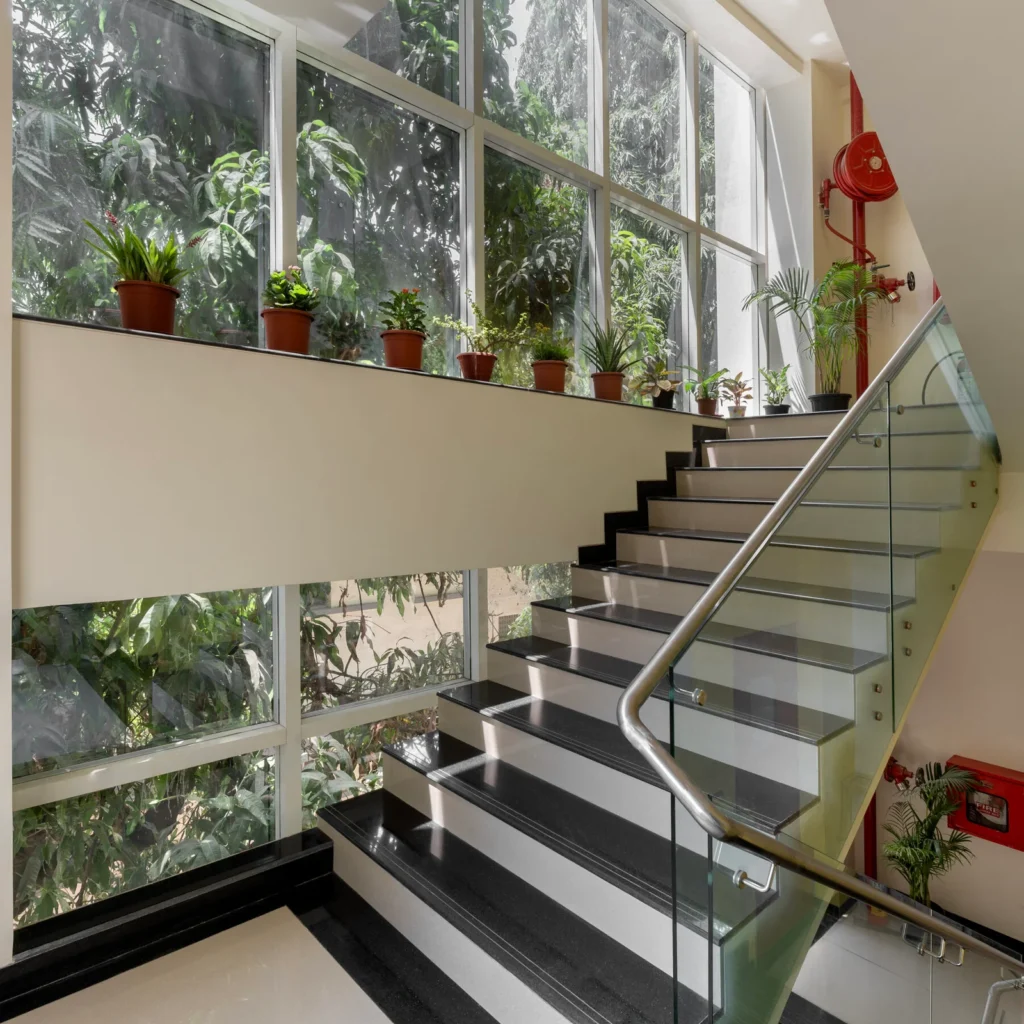
Certain spaces often make us feel that no other texture, tone or even colour could’ve been tailor-made compared to the present visual, a credit to the designers’ commitment.
The larger perspective extends beyond Cloud Dancer or any singular tone. It questions how we assign roles to colours: when does a surface behave as void, and when does it operate as backdrop?
After-thought:
The discussion, therefore, is not about elevating one colour over another. It is about recognising that subjectivity does not negate function.
Cloud Dancer feels familiar because designers have relied on it for years without naming it. Perhaps the real contribution is in prompting us to reconsider and broaden our understanding on what feels effortless.